
Highlights are basically collections of existing and previous Instagram Stories, featured on the account’s profile page. They extend the 24-hour life of Stories, and more importantly, allow brands to further polish their profile pages with customized thumbnails and captions.
In this post, I’ll be sharing some of the most commonly used design strategies for Story Highlights, with a few examples for each strategy. Before we start, if you’re wondering how to create highlights on Instagram, see steps here.
The planning phase: what to consider
Each Highlights collection includes a thumbnail, a caption, and many Instagram Stories. So, in the planning phase, think about the following:
- What Stories should be featured?
- How to categorize these Stories?
- Do the categories help the audiences/followers navigate the page, understand the brand, and engage with the business (place orders, buy tickets, check out articles, etc)
The design phase: strategies and examples
Here, I’m sharing 4 popular design strategies for thumbnails: icon-centered, text-centered, color-only, and combining brand elements with photos.
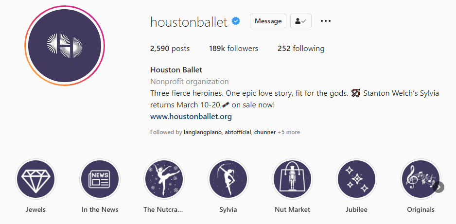
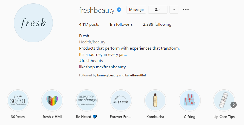
Strategy 1: use icons
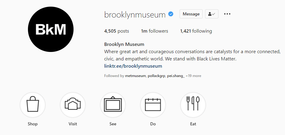
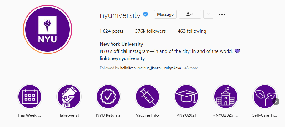
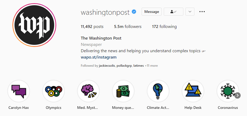
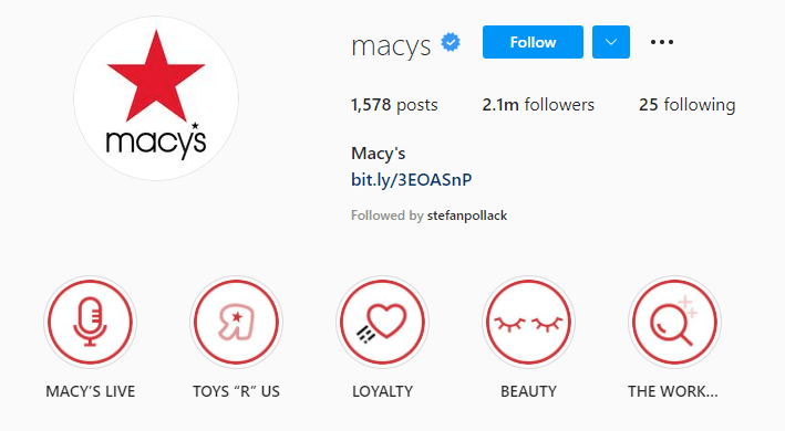
This seems to be the most popular one. Brands across all industries like icons. Indeed, icons are very effective. They’re like road signs, helping viewers quickly find what they need. When using icons in your thumbnails, make sure that all of them are consistent in terms of style and size. Check out the following examples:
Example: Brooklyn Museum
Example: New York University
Example: The Washington Post
Example: Macy’s
Example: Houston Ballet
Example: Fresh
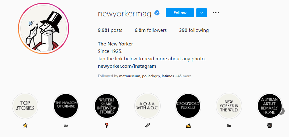
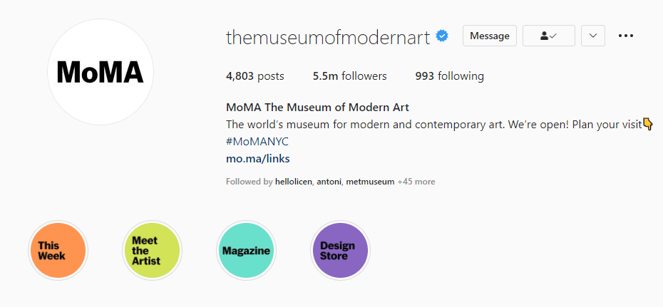
Strategy 2: use text
Text-dominant thumbnails are straigtforward and can convey more complex information than icons. Note that you still need to put some design into these words and phrases: use your brand’s fonts and colors, as well as follow other rules in the brand guidelines.
If text looks too boring, probably add some graphic elements to the captio. In the examples, the pages of The New York Times and The New Yorker both use a reversed combination of image and text in this section: text as thumbnails, and images (emoji) as their caption. This adds more fun to the browsing experience.
Example: New York Times

Example: The New Yorker
Example: MoMA
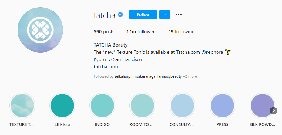
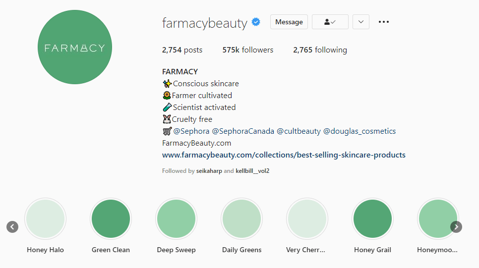
Strategy 3: use colors and nothing else
These gradient thumbnails serve as visual elements for the brands’ profile pages. Together with the well-curated posts, they make these page very stylish – which matters to beauty and fashion brands.
I guess minimalism also play a part in it. If you’re a fan, you’ll like this color palette strategy.
Example: Tatcha
Example: Farmacy
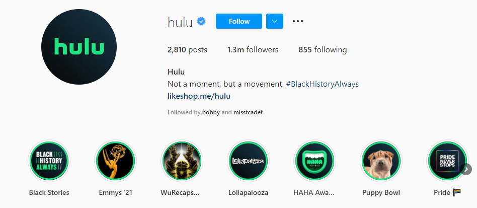
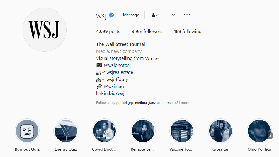
Strategy 4: add some brand elements to photos
Use a specific filter, or just add a circle to each thumbnail. This strategy may look like a time-saving shortcut, but I think it’s a productive way to combine up-to-date content with a bit of brand identity. For companies that really care about novelty, like streaming platforms, maybe this strategy is better than anything else.
Example: Hulu
Example: The Wall Street Journal
Hope this post provides some inspiration for your Instagram strategy! If you have thoughts to share, feel free to leave a comment.
