This post is a summary of a recent social media analytics task. I’d like to jot down my thoughts, trials and errors, as well as share the final solution – not 100% ideal, but it works.
If you have comments or suggestions, please feel free to leave a note!
The task
Get more insights into a LinkedIn user’s follower growth, profile views, and performance of specific social posts. Ideally, we want to generate an automated report that updates itself and can be accessed anytime.

The challenge
Despite the fierce competition among enterprise-level solutions, there are few tools available for personal account analytics.
- LinkedIn’s own analytic tools
Although Linkedin provides a variety of metrics and analytic tools for company pages, it offers few tools for individual users to track their social performance.
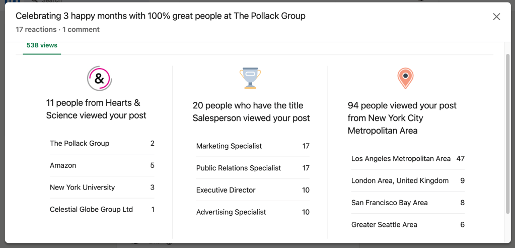
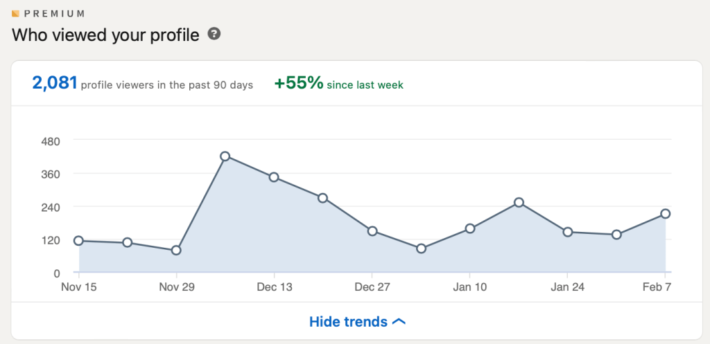
Under each post, there’s a section that shows the number of views as well as a brief description of people who have seen the post – their companies, titles and locations, summed up on a pop-up card. Users on premium plans have additional insights into visits to their profile pages. These are pretty much all the data-powered insights an individual user can get.
- Any third-party tools?
I looked for LinkedIn analytic tools across the internet, and found many tools provided by well-known social media management platforms. However, almost all of them are designed for enterprise users. The only one that seems like a good fit costs $10/ month – a good deal, but I’ve never heard of it, so I decided not to give it my credentials for cybersecurity concerns.

- DIY a tool?
Using some external help, I tried scraping data with a few lines of code. The program worked on the first 2 days – it logged in to my LinkedIn account, checked the views, likes, and shares of my recent posts, and put the numbers on a spreadsheet with timestamps.
I was glad that my computer did the boring stuff for me, and thought I could spend a few more days to debug (sometimes the program recognized the wrong numbers). However, when I checked out my account, I was redirected to the sign-in page. Apparently, LinkedIn had kicked me out.
Then I entered my credentials to log in, a pop-up window showed up, with a warning message telling me to stop using automated tools.
If we receive an abnormally high number of page requests or detect patterns that indicate the use of an automated tool, we may suspend or restrict that account. This is to guard and protect member privacy.
Unusually high traffic volumes can be generated by third-party applications or browser extensions that copy data from, automate activity on, or otherwise interact with LinkedIn in violation of LinkedIn’s User Agreement. If you use any such software, we require that you disable it.
(See LinkedIn’s full explanation and additional policy details here)
Now that I had to stop running my code, I was happy that I didn’t spend $10 on that tool I found earlier. Apparently, using third-party tools on personal LinkedIn accounts is not permitted by the platform. Therefore, I don’t think there are any official APIs for this purpose either.

My solution: Google Data Studio + Google Sheets (with manual notetaking)
This is obviously a compromise. While the Google Data Studio report automatically updates itself, I am the human who puts numbers into the data source, a Google Sheets file. Luckily this is not a lot of labor – I’m only taking care of one account, running a customized enterprise-level analytics solution for a personal user.
I think my digital marketing coworkers are going to laugh, but this works. Here’s how I built the report, with screenshots and a link to a sample report, with the following components:
- Google Sheets with these tabs:
- Followers
This tab includes 3 columns: date, followers and net new followers (today’s followers minus yesterday’s). With these, we can generate a chart that captures follower growth. It’s similar to a stock chart – a time series of price (number of followers) and volume (each day’s net new followers).

- Profile views
We can easily find a premium account’s weekly total profile views of the past 3 months on LinkedIn. Note that LinkedIn’s weekly views equal the sum of daily views in the past 7 days – if you’d like to track views over a long period of time, remember to take notes on the same day each week. This way, you get consecutive weekly totals that don’t overlap each other.

On the spreadsheet there’s a column of percentage change = [(this week – last week)/last week]. I decided not to include it in the profile views chart, because it provides little additional insights in this case. The fluctuation of profile views is already well captured by the original numbers.
Don’t forget to specify the year of every date, so the chart won’t look ridiculous and mysterious.
- Post performance
One tab for each post, including the following columns: views, likes (reactions), shares, comments, engagement. Engagement is calculated as the sum of reactions, comments and shares divided by views.

While there are other ways to calculate engagement, such as using the number of followers as the denominator, in this case, I think it’s more reasonable to use views (reach).
- A Google Datastudio report with the following pages:
- Follower growth overview

- Profile views overview

- A page for each post
Each page includes a snapshot of the post, a chart for performance stats, and another chart for engagement, where I use an orange reference line to mark the 2% engagement rate goal.

After making charts for dozens of posts (by simply duplicating previous pages and then changing the data sources), I found that engagement rates are typically the highest in the first few days after publication, and then decrease slowly over time.
Comparing my data source and the client-facing Google Data Studio report, I think we can all agree that visualization is very important.
Another good thing about Google Data Studio is that it’s interactive. The viewer can hover and discover data points, or use filters to find specific information. In my report, I leave a date range controller on each page. Since the data structure is pretty simple (only 1 account involved) I think extra buttons are not necessary.
Sample report here
See a sample Google Datastudio report here:
